LimerickTangerine
Well-known member
I hope if they do short sleeve Keeper shirts like this season, if they do i hope they go bigger sizes then a Large.
Yep. Should be no black in the mix whatsoever and not too much redYep - our current shirts look red on the telly and in photos. Tangerine is lighter as DT shows.
The way the world is going we should get Hospice and give them a couple of million,if thats enough for them.Would love to see a local sponsor.
Victrex?
But would still be made in IndonesiaEasywear shirt for me, with or without floppy collar. English company too.
Stupititious - don't know that one (not being sarcky btw). I looked it up and found a modern, urban derivative of superstitious about 'stupid shit': stupidtitious. Is that what you were aiming for.I’m stupititious. So that’s a definite no for me then! And any other relegation offerings!!!!!!
These puma tops are no good for out plumper fans, never seen so many pairs of tits.
I’m flattered that your research provides education to the masses. Good on youStupititious - don't know that one (not being sarcky btw). I looked it up and found a modern, urban derivative of supestitious about 'stupid shit': stupidtitious. Is that what you were aiming for.
I always buy the Toffs historic shirts because (a) no advertising (b) the don't age and (c) I know all too well that my latter middle-age body shape is not modelled on Daniel Craig.These puma tops are no good for out plumper fans, never seen so many pairs of tits.
Don't get your hopes up Dollar.Aren't you more a Wendy Craig?

Yes we are apparently, shop rang me the other day about something so I asked them.Are we even getting a new kit, this season's are still price so it doesn't look like it.
Every club has a new kit every seasonAre we even getting a new kit, this season's are still full price so it doesn't look like it.
That's not actually true, some clubs have the same kit for a couple of seasons.Every club has a new kit every season
Villa supported their local hospice a few years ago on the away shirt.The way the world is going we should get Hospice and give them a couple of million,if thats enough for them.
Why would they? The shirts will have the club’s badge and that is not the tower logo…Lets hope they put the tower logo on the away shirt .
View attachment 6432
Well they seem to be pushing that logo, more than the roundel one, it's just an idea and one I think would look good.Why would they? The shirts will have the club’s badge and that is not the tower logo…
There's a few clubs with Puma shirts that have started to release the shirts, so I would think that ours will be any time. I really want one for summer for sure.I hope that, especially after the promotion, we’re better prepared than in previous seasons - end of the day football shirts are a summer accessory and I bet there’s a couple of thousand waiting with their money in their pocket for a new shirt - a bit like with the season tickets, it just feels like we’re missing out on that instant feel good factor.
They were half price before the play offs, my mum got the away shirt so probably put them back up trying to get a few quid from the feel good factor, which I can't fault them for.Are we even getting a new kit, this season's are still full price so it doesn't look like it.
Not really good business, not many are going to pay top dollar for a shirt that will be outdated in a matter of weeks. Not really a decent variety of sizes left either, most seem to be 4xl. You'd think they'd just want rid rather than be stuck with them.They were half price before the play offs, my mum got the away shirt so probably put them back up trying to get a few quid from the feel good factor, which I can't fault them for.
No such thing as orange, just lighter tangerineWhat did we think of lasts season's tangerine colour? Still way too orange for me!
Think they missed a trick with that producing so few shirts. Be good if they had it again next season with new sponsors potentially?I loved all of last seasons shirts especially the blue one
The shirts are always orange ... the only tangerine shirt we have had was the 2005/07 Point Bet Games Uhlsport kitWhat did we think of lasts season's tangerine colour? Still way too orange for me!
Stoney meant superstitious!Stupititious - don't know that one (not being sarcky btw). I looked it up and found a modern, urban derivative of superstitious about 'stupid shit': stupidtitious. Is that what you were aiming for.
Is there a better sponsor than the town itself?? or would you prefer young kids running around in shirts advertising betting shops!Think they missed a trick with that producing so few shirts. Be good if they had it again next season with new sponsors potentially?
We've had this disagreement so many times. I have a tangerine mug unconnected to the BFC.What did we think of lasts season's tangerine colour? Still way too orange for me!
There are various different shades that are considered Tangerine, owning a mug with the defined shade by the British Colour Council that ceased to exist in the 50s doesn't mean you can talk on the matter with absolute authority.We've had this disagreement so many times. I have a tangerine mug unconnected to the BFC.
It states on the base of the mug 'British Colour Standard' No 55 Tangerine. Created in 1931.
Trust me, it's only factionally less vivid than the current shirt hardly noticeable with the human eye.
I always though Tangerine was slightly darker and less bright than orange.. thank god!
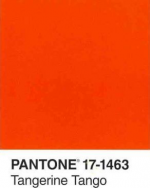

Then how do you know the badge is right? Wasn't the lettering redesigned quite recently. To my eye your sample looks closer to gold/amber as worn by Wolves and Hull. Your upper Pantone sample looks more red than anything I've ever seen associated with BFC.There are various different shades that are considered Tangerine, owning a mug with the defined shade by the British Colour Council that ceased to exist in the 50s doesn't mean you can talk on the matter with absolute authority.
The standardised colour matching system and has been for yonks is Pantone, their version of Tangerine is as light as it gets. The colour we currently play in is closer to their "Tangerine Tango":
View attachment 6484
But lets forget about mugs and standardised colour matching systems, we should play in a colour that exists within in our badge:
View attachment 6485
That shade within the crest is more more reminiscent of this, which to me is Tangerine. Completely unique to us and unmistakably not Orange:
View attachment 6486
Then how do you know the badge is right? Wasn't the lettering redesigned quite recently. To my eye your sample looks closer to gold/amber as worn by Wolves and Hull. Your upper Pantone sample looks more red than anything I've ever seen associated with BFC.
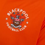

Never orange, only a different shade of tangerineThe shirts are always orange ... the only tangerine shirt we have had was the 2005/07 Point Bet Games Uhlsport kit
I agree it's not worth loosing sleep. But every retro Pool shirt (50s and 70s) I bought started off more like the current pool top but after numerous washed ended up not to dissimilar to the amberish tangerine. Thats where the confusion comes from, particularly for older supporters. Cotton tops faded very quickly and fans got acquainted with the faded Tangerine. IMHOView attachment 6488
View attachment 6490
That looks very, very close to me. On TV/highlights we actually look like we play in Red sometimes.
I think they've got it right in the crest personally. Doesn't look Amber to me and if you google the simple words "Tangerine Colour" you will see various shades but what you're immediately presented with is the exact colour that exists in our crest.
I certainly don't lose sleep over it, but I would prefer we play in the lighter Tangerine as its more unique to us. I have a 60s Blackpool top and the most recent kit, when they're hung up next to each other in the wardrobe the difference is obvious.
And from memory that shirt was a bit of a last minute rush as we were weeks away from the start of the season and koko still didnt have a shirt manufacturer sorted out.The shirts are always orange ... the only tangerine shirt we have had was the 2005/07 Point Bet Games Uhlsport kit
AgreedWell they seem to be pushing that logo, more than the roundel one, it's just an idea and one I think would look good.
There will be a new sponsor I believe. Probably time to start realising the worth now. Hopefully Visit Blackpool remain on the third kit perhaps???Interesting 'Visit Blackpool' did a tweet yesterday saying they were proud to have sponsored our 20/21 shirts .. presumably means a new sponsor for the new season?
I think the prem one was quite tangerine too.The shirts are always orange ... the only tangerine shirt we have had was the 2005/07 Point Bet Games Uhlsport kit
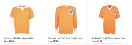
I personally don't think it's a case of our kits faded to the lighter colour when the lighter colour is a widely accepted (possibly the most accepted) shade of Tangerine, that'd be some coincidence. The 60s top I have is a remake and they all come in the lighter shade of Tangerine, here how Toffs remake them - I suppose they must have modelled them on how they came out after a few washesI agree it's not worth loosing sleep. But every retro Pool shirt (50s and 70s) I bought started off more like the current pool top but after numerous washed ended up not to dissimilar to the amberish tangerine. Thats where the confusion comes from, particularly for older supporters. Cotton tops faded very quickly and fans got acquainted with the faded Tangerine. IMHO
Plus your BFC badge image is nothing like the official photo of the current shirt further up the board. Match colour in photoshop by any chance?
